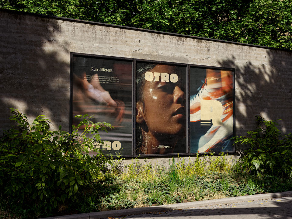
OTRO
Run Different.
ORTO is a community driven app that brings together members of the diaspora through running. The concept was born from a simple but powerful need. To create safe, culturally affirming spaces where people of color can move, heal, and connect.
CASE STUDIE
ORTO is a community based running app designed for people from the diaspora who seek connection, healing, and belonging through movement. Born from personal research into cultural identity and wellness, ORTO challenges the idea that running is only about performance. Instead, it creates space for community and roots.
The app helps users find running clubs with like minded people, based on culture, rhythm, and shared values. It’s not about performance, but about presence, softness, and solidarity.
MY ROLE
I am responsible for concept development, target audience definition, tone of voice, in app copywriting, and visual direction for the Orto project. The platform aims to create an inclusive and authentic space, focusing on fostering community and representation.


Traditional running spaces often lack representation and a true sense of belonging. Orto fills that gap.
BRAND INSIGHTS
ORTO was born from my personal research into the disconnect many people from the African and Caribbean diaspora feel when it comes to traditional wellness spaces, especially in areas like sport, health, and community. I discovered that running, often seen as individual and performance driven, could also be a form of collective healing and cultural reconnection.
I created ORTO as a speculative case study to explore what it means to build a wellness space rooted in softness, community, and culture. The goal: to empower people from the diaspora to reclaim movement as a space of belonging, not exclusion. ORTO connects users with local run clubs that reflect their rhythm, identity, and story.

CULTURAL SENSE IN DESIGN
One of the main challenges was designing a wellness product that truly resonated with the diaspora. Traditional wellness and running platforms often feel clinical, impersonal, or overly performance-driven. ORTO needed to feel like home. I translated this need into a bold, calm, and warm visual language — classic in tone, but deeply rooted in identity and softness.
BALANCING FUNCTION WITH EMOTION
As a digital product, the app had to be functional and accessible, but also emotionally resonant. The challenge was to combine usability with a sense of care and culture. It's not just a running app, but a space for community and healing.
VISUAL IDENTITY
The visual identity for ORTO was created to reflect the brand’s core values of belonging, softness, and cultural pride, while resonating with members of the African and Caribbean diaspora seeking connection through movement.
ORTO’s color palette combines deep earth tones and warm neutrals, inspired by nature, skin tones, and cultural textiles. This grounding visual approach reinforces the brand’s message of rootedness, safety, and identity. Instead of loud athletic branding, ORTO leans into softness and intention.
The typography and layout feel classic yet contemporary, evoking both movement and stillness.


